Poppy Soda Can Design System | Process
A soda can packaging system exploring brand language, color, and form consistency across a multi-flavor lineup.
Jump to section:
Design Opportunity
Create a branding design system for a soda brand using the brand’s established logo.
Design around the pre-determined flavor systems, while creating label designs that are effective both side-by-side and individually.
User / Context
Young Adults (Target 18-40yo)
Appreciates all-natural products
Health Conscious
Modern & Sleek Design
Vibrant & Eye-Catching
Design Conveys Quality
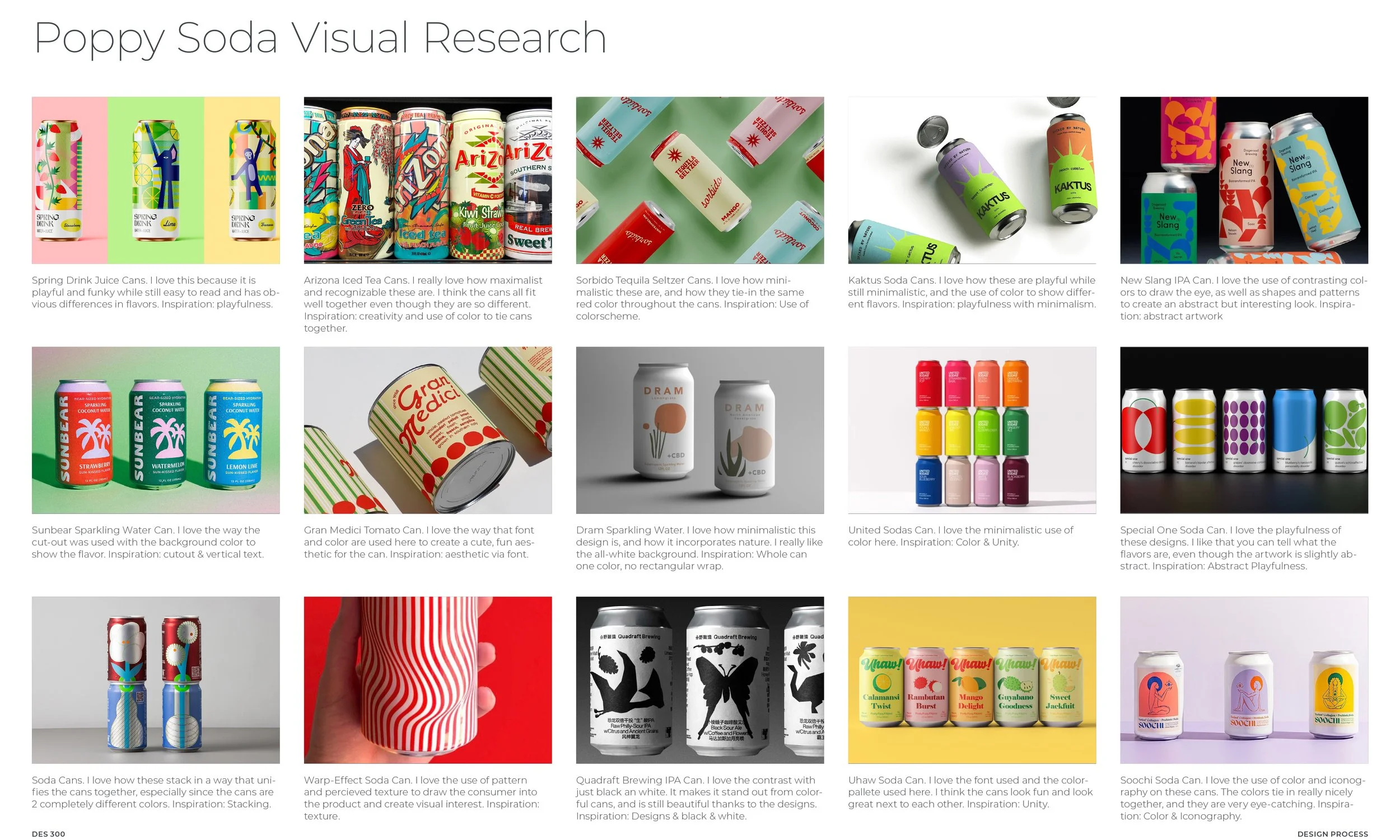
Concept exploration
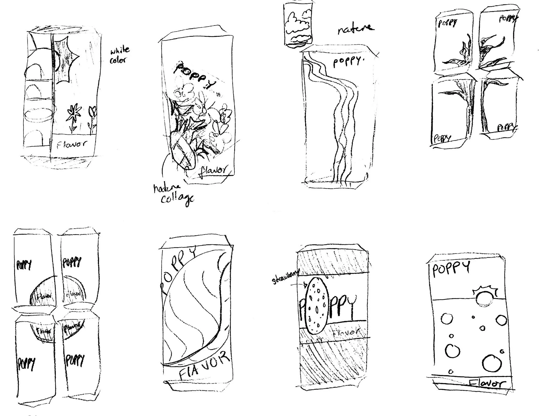
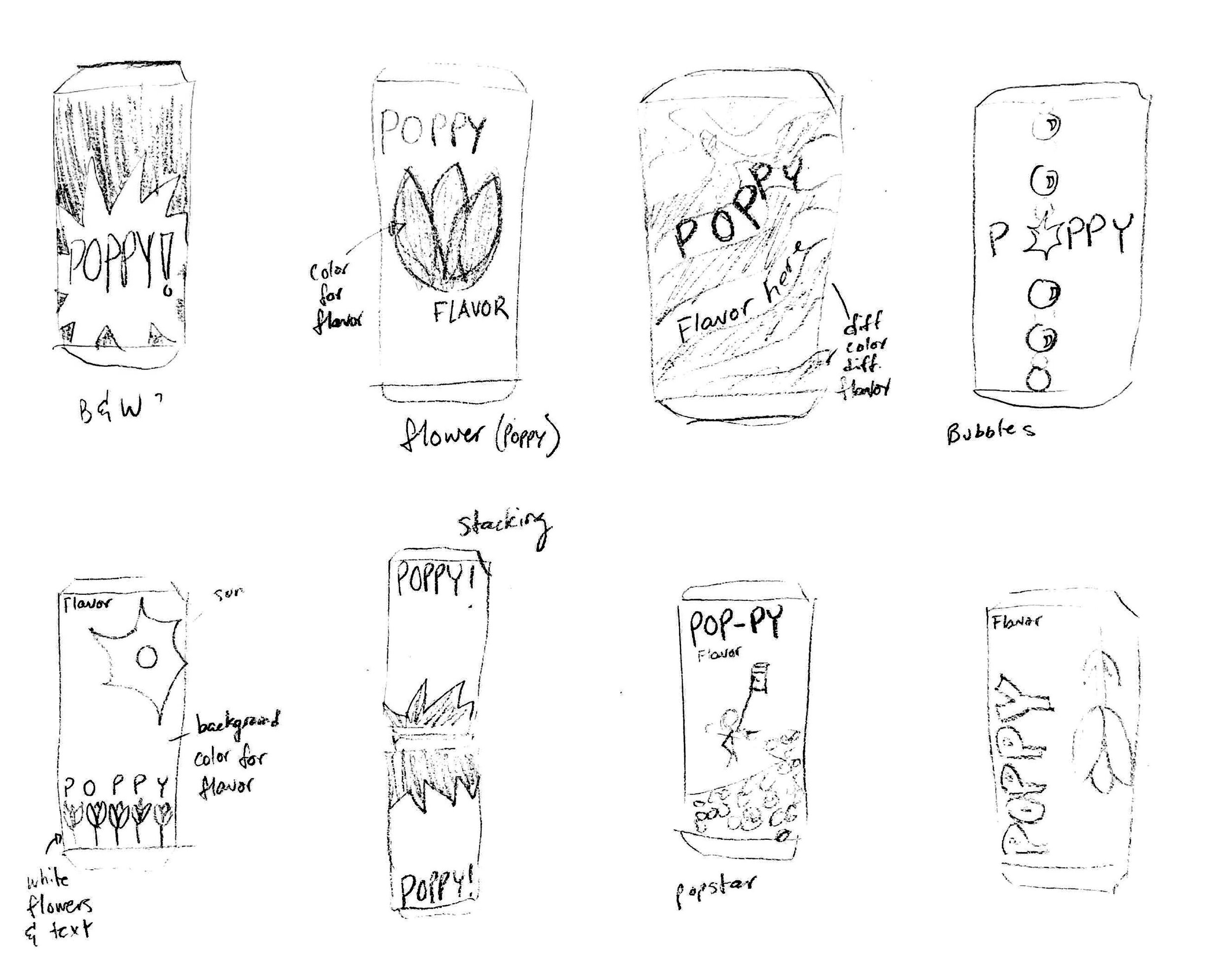
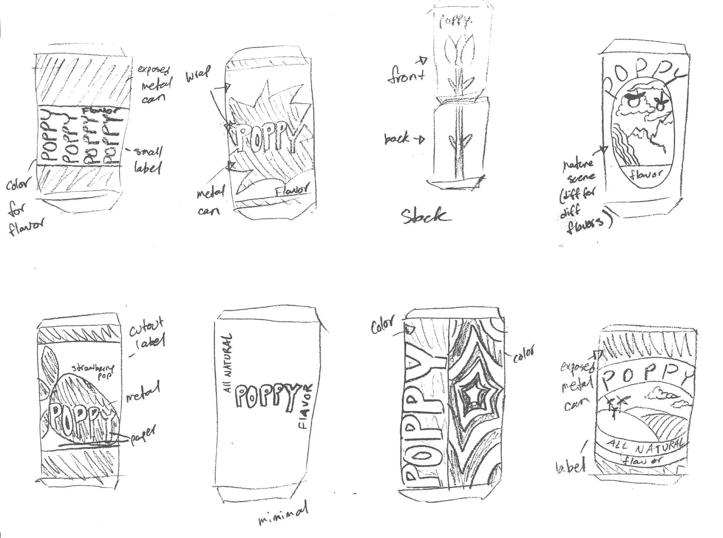
Early Ideation
30 second exploration sketches exploring layouts, designs, and branding cohesion.
“No Bad Ideas”-stage.Rough Concepts
Early Sketching that influenced further ideation & final concept.
Focus is on simple but eye-catching, nature-inspired designs.
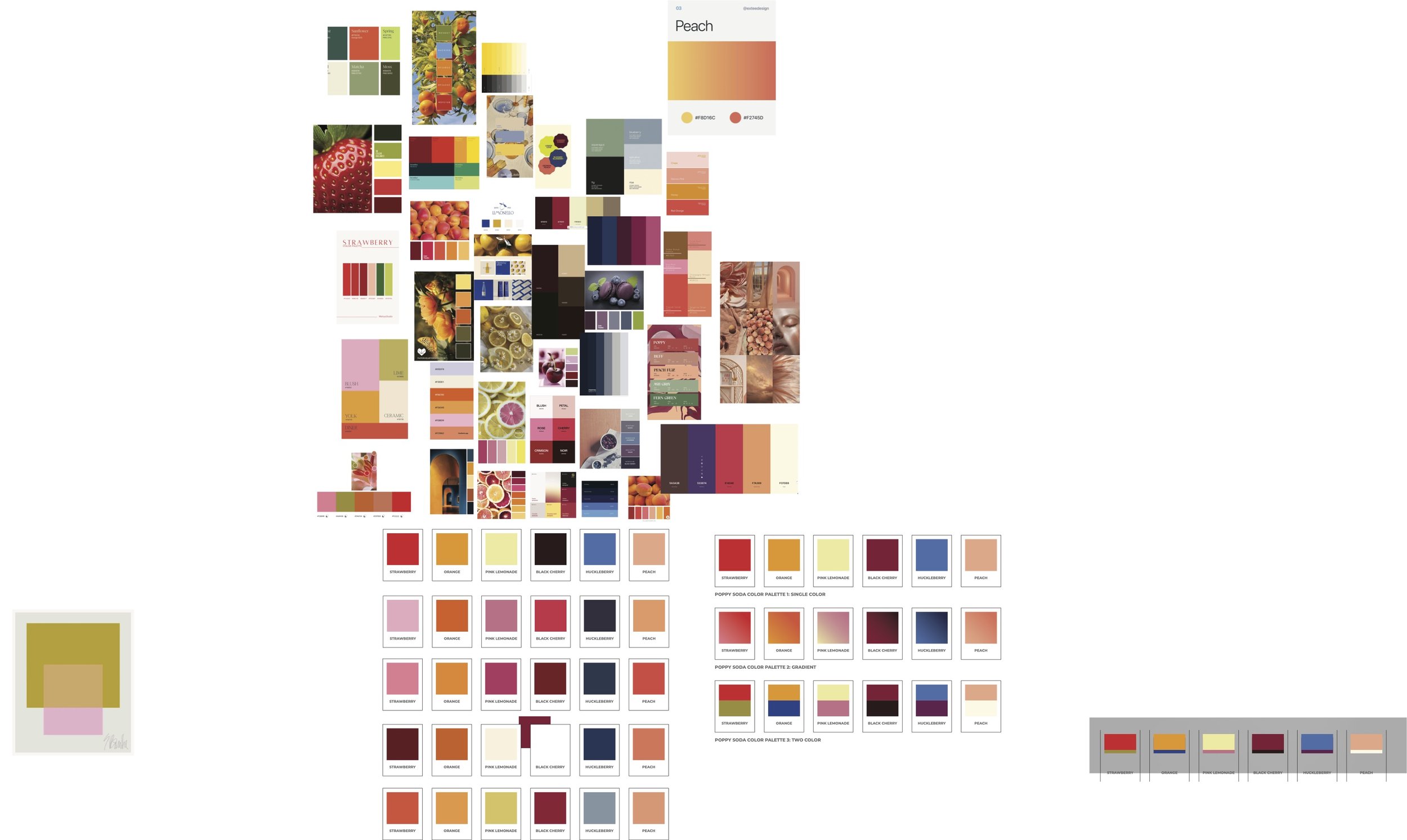
Exploring Color
Gathering & refining a vibrant color pallete that projects mouth-watering, all-natural flavor.
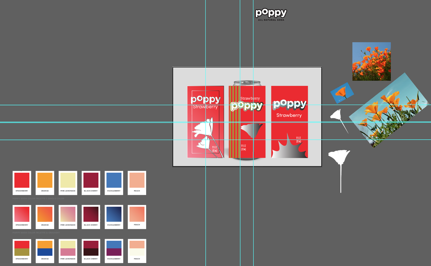
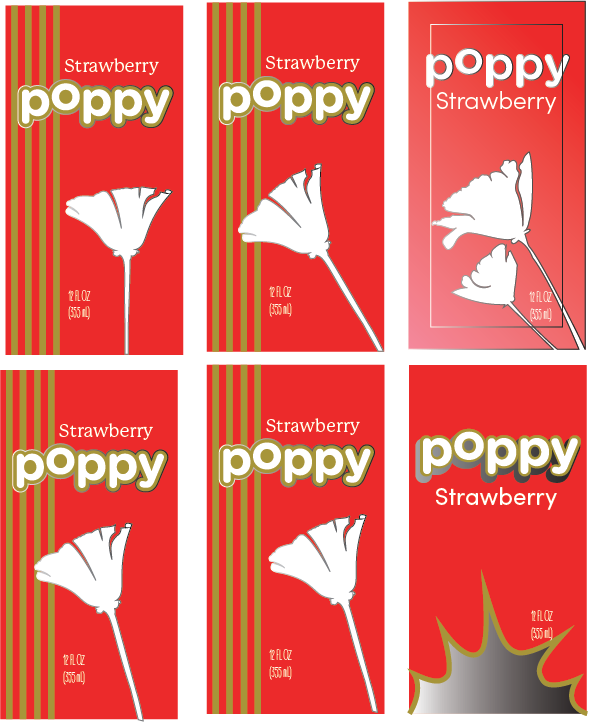
Early Digital Ideation
Exploring multiple higher-fidelity version of concepts from “lighting round” ideation.
Giving multiple ideas a chance to evolve- no boxed-in thinking at this stage.
Decision Making
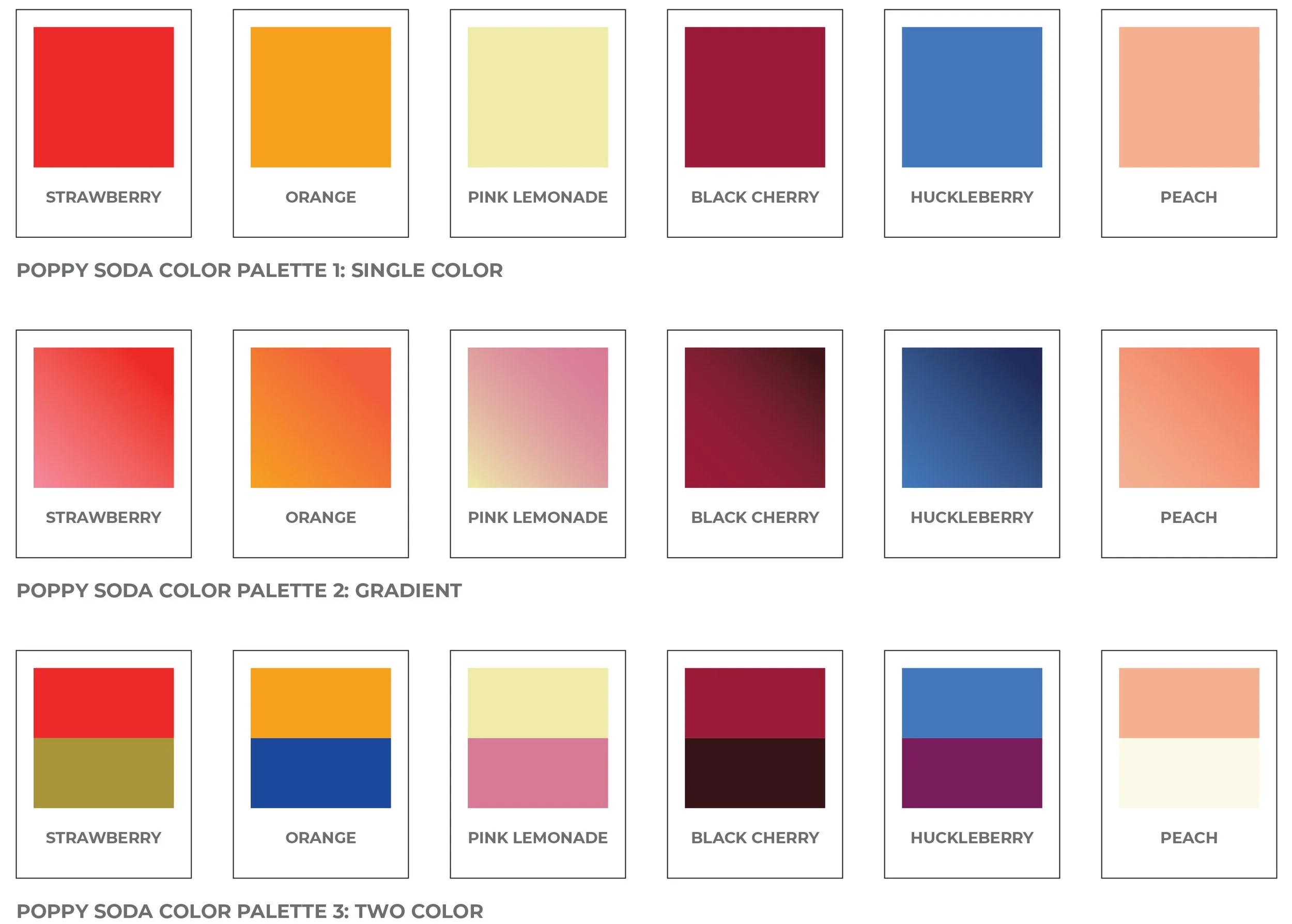
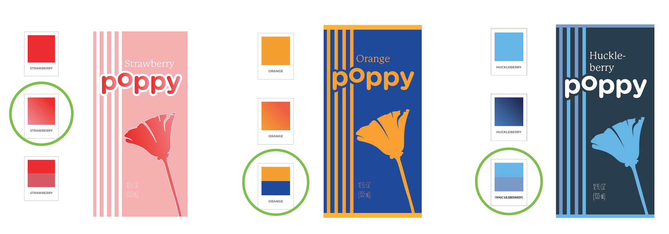
Narrowing Color Palette
Whittling down color systems to 3 possible palettes.
Emphasis remains natural & vibrant.
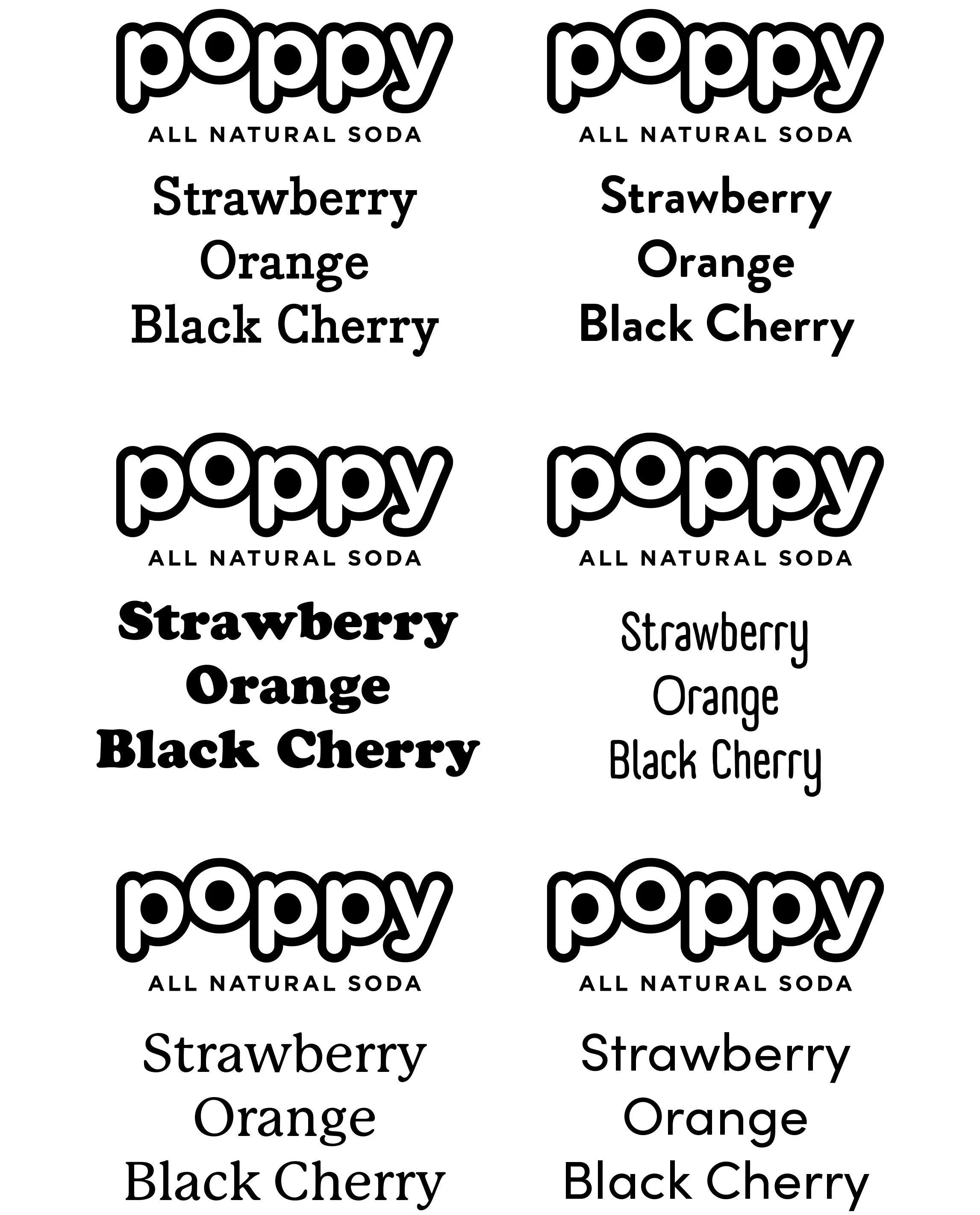
Font Ideation
Narrowing down font choices that match or contrast the playful, rounded logo design.
Two possible directions:
Playful, “farm-to-table”- inspired
Sleek & simple
Decisive Ideation
In further digital ideation of both layout and color, I focused in on the bottom middle design.
Reasoning: the grounded & playful elements merge to create an eye-catching & natural feel.Final Ideation Choices: Right-most Design
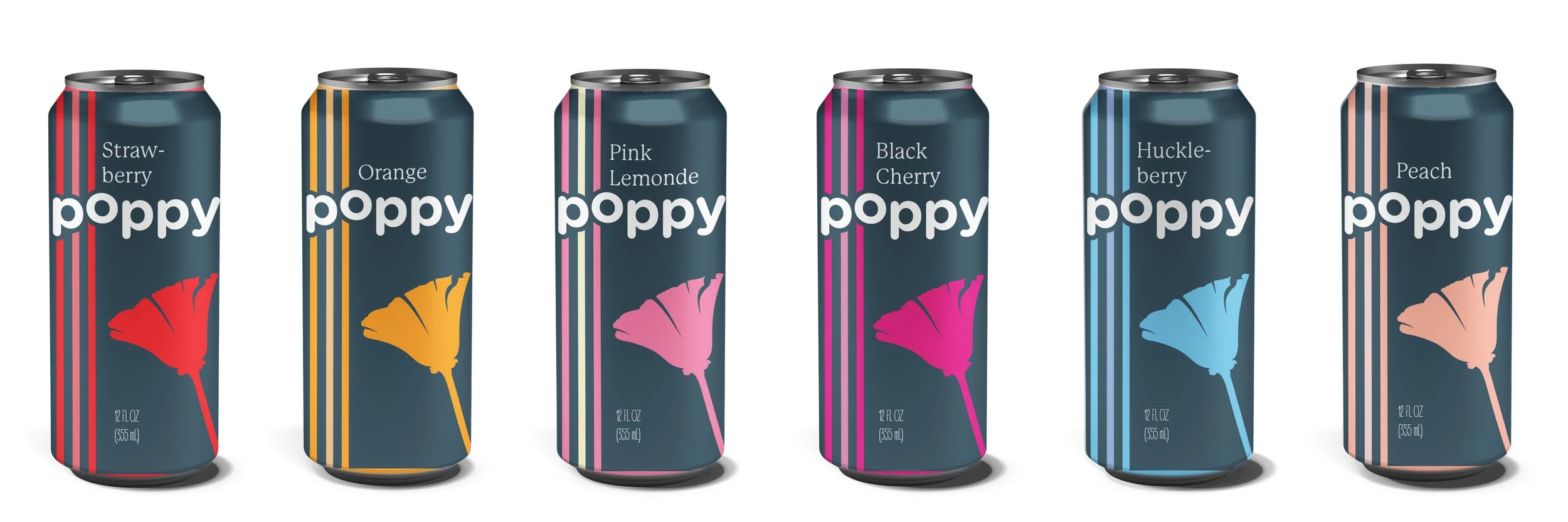
Sleek flower silhouette mirrors & contrasts the “poppy” logo - merging “natural” and “upscale”.
Charcoal background creates upscale feel without diminishing color vibrancy.
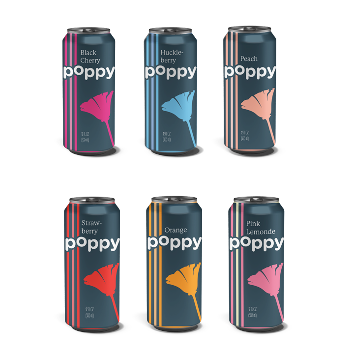
Final Outcome
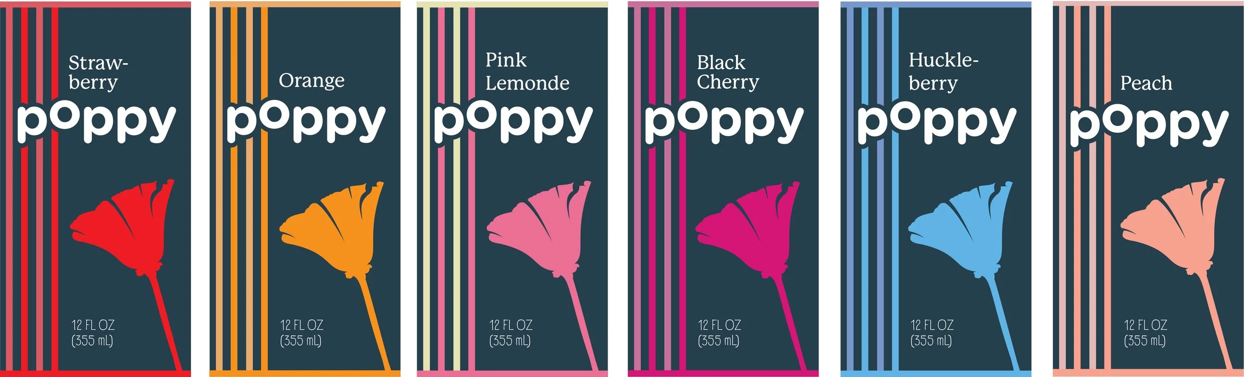
Final Design - Flat
High-end design that conveys tasty all-natural flavors while staying true to Poppy branding.
Charcoal background and flower silhouette act as unifying elements that tie all labels together.Font choice is sleek yet organic, merging the playful branding with sleek label design.
Final Design - Render
Result: Unified and unique label system that reads beautifully on the shelf.
Project Reflection
What I Learned
Company Branding doesn’t have to limit design outcomes
I really enjoyed problem solving, making the goal of a high-end product design work with the contrasting, playful logo
How following the design process closely benefits a concept
Project Constraints
2 week time frame
No opportunity for feedback during iteration
Pre-established company branding
If I had more time I would…
Gather collaborative feedback and continue to iterate throughout multiple stages of development
Expand on several parallel concepts instead of focusing on one until later in the design process